Monday, May 28, 2012

Weekly Challenge #72


This week's challenge at I am the Diva is "Tangelation Nation - Crescent Moon". Crescent Moon is one of the foundational, official tangles. Tangelation is using just one tangle and create variations of it. This is my version of this tangle. The "tile" is actually a 5" by 5" Ampersand aquabord. I created the background colors using Dr. Ph Martin's India inksCrescent moon reminded me of blue color, so I painted the tile blue first. Then I drew the tangle using white gel pen. I intentionally left a blank space  and filled it with Sanskrit text. In writing the text, I rotated the tile so that a portion of the text can be read from each direction. As I had noted in my previous post, I will be using these as coasters. 


Thanks for visiting. 

Saturday, May 26, 2012

Weekly Challenge #71


This week's challenge at I am the Diva CZT is to use the latest official tangle called Pea Nuckle. This is my version of this tangle. I used it as a link to other larger tangles. The "tile" is actually a 5" by 5" Ampersand aquabord. I created the background colors using Dr. Ph Martin's India inks. Then, I wrote a few sacred verses in Sanskrit using a gold pen. Then I drew the tangle using white gel pen and black Deco art pen. I will seal it with a clear acrylic sealer since I want to use it as a coaster. These aquabord are four in a packet; so they make a nice set.


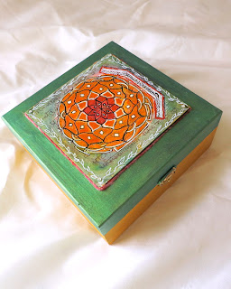
On this box (below) I used the aquabord to paint the mandala design.


Thanks for visiting,

Friday, May 25, 2012

Monday, May 21, 2012

Sunday, May 20, 2012

Mandala Tile Zen Art Box


This is the last of my "art" boxes, as boxes of this size, shape and wood are no longer available in the market. To make this special, instead of painting directly on the top of the lid, I created the mandala on a watercolor aqua board. The mandala is based on the Indian "rangoli" or "kolam". 


The design is drawn on a background that was first painted with India and acrylic inks. Over this background, I hand wrote several sanskrit verses: (1) invoking Ganesha, the elephant god, known as remover of obstacles, (2) couple of verses from Yoga texts, (3) a verse from Bhagavat Gita. I scrubbed the board to give it a weathered finish. Typically kolam or mandala is drawn on washed and scrubbed mud floor and I wanted the same look on the board also. Finally, I drew the mandala over this background with black and white inks.


The aqua board was anchored on top of the box with strong gel and nails (they are invisible). The top of the box was painted a lovely shimmery peacock green using Jacquard's Lumiere paint.

The sides are painted in coordinated colors. The inside of the box is layered with foam. 

The inks and the aqua board are archival. Several layers of varnish have been added to protect the paint and the design. 

The box measures 7"x7"x3". A capacious box, it can be used in multiple ways--to keep your journals, prayer beads, jewelry, photos etc. It would also make an excellent gift.

You will find more hand painted, decorated boxes in my Etsy shop 

21 Day Photo Challenge: Three Things


Three Things is the theme for today at the 21 Day Photo Challenge over at Elle Moss Photography. These are photos I took at the Metropolitan Museum of Art last November. All of these except the last one are from its medieval, renaissance collection. The last photo of Iranian turquoise pottery is from the Islamic art collection. Enjoy.


Thanks for visiting.

Saturday, May 19, 2012

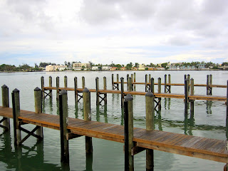
21 Day Photo Challenge: Horizon


Horizon is the theme for today at the 21 Day Photo Challenge over at Elle Moss Photography. Of the many photos I had I chose this one because how the foreground and the horizon lend a balance to the composition.

Wednesday, May 16, 2012

Zentangle Weekly Challenge #70: Color Me Sepia


This week theme at I am the Diva Zentangle is Color me Sepia. I had already anticipated the challenge a week ahead by doing the Week #69 challenge "Groovy" in all sepia! I had to come up with something different, and Zentangle color challenges usually lend themselves to much creativity.

Recently, I have been working on making little journals using various formats and materials. For this challenge, I created a 2 1/2" by 2 1/2 square coptic journal. The covers of the journal are made of thin wood (probably balsa). I distressed the wood first and then drew a ZIA in sepia. I added a touch of white around the sepia with Dr. Martin's Bleed Proof White, which added some pop to the brown.


Thanks for visiting.

21 Day Photo Challenge: Grass


Grass is the theme for today at the 21 Day Photo Challenge over at Elle Moss PhotographyCows eating grass! As it should be. 


Thanks for visiting.

Monday, May 14, 2012

21 Day Photo Challenge: Dress


Dress is the theme for today at the 21 Day Photo Challenge over at Elle Moss Photography. The one above is a photo of a Chinese boy posing in a traditional Chinese dress (you can see the blue jeans underneath). The one below is a young Indian girl all dressed up for her cousin's wedding.


Thanks for visiting.

Weekly Challenge #69: UMT v.IV: Groovy

For this challenge at I am the Diva we have to use a tangle called "Groovy" created by Eden at Cut'n It Up. The cognoscenti will pick up where groovy is located in the Zia above.

Thanks for visiting.

Friday, May 11, 2012

21 Day Photo Challenge: Architecture


Architecture is the theme for today at the 21 Day Photo Challenge over at Elle Moss Photography. This is a photo of the Great Wall of China, the northern section (off Beijing) I took four years ago. 


Thanks for visiting.

Thursday, May 10, 2012

21 Day Photo Challenge: Rainbow


Rainbow is the theme for today at the 21 Day Photo Challenge over at Elle Moss Photography. I did not have a photo of the natural phenomenon. But, I do have lots of photos that are colored like the rainbow. I took the photo of the bangles above at one of the sidewalk stores in Chennai. I think the colors of the bangle fit the rainbow theme, don't you think?


Wednesday, May 9, 2012

Tuesday, May 8, 2012

21 Day Photo Challenge: Trees


Stacey Merrill posted it on her Facebook page about the 21 Day Photo Challenge over at Elle Moss Photography. The themes are fun and easy and it is a low-stress challenge. So, I decided to participate as much as I can. Above is my photo for day 2 theme: Trees. This is a photo of a papaya tree outside the Flamingo Garden in Ft. Lauderdale. Here is a closer look.


Thanks for visiting.

Monday, May 7, 2012

Light of Lakshmi


I have several of these candle jars which come in a range of beautiful colors and wonderful fragrances. They sit on the mantlepiece above the fireplace in my living room and complement the decor of the room. But the jars themselves are pretty bland on the outside.


I have been toying with a few ideas when I happen to see this beautiful Lakshmi label on the Graphics Fairy. I immediately knew where it belonged. It was like godsend--Lakshmi, the goddess of wealth illuminating the world. I sized and printed several copies on a tracing paper (for instructions on printing on tracing paper, click here)  and glued them around the jar. I also printed several copies of a jasmine perfume label also from the Graphics Fairy and affixed them above the Laksmi pictures. They fit perfectly and the overall effect is divine!


Thanks for visiting.

Saturday, May 5, 2012

From Photograph to Painting


I grew up in a big megalopolis and even afer living in the suburbs for the last thirty years, I am still a cityl girl at heart. Cityscapes inspire me. I am too self conscious to park my easel on the street and start painting. So, I do the next best thing. Take photos and then when time permits convert them into painting. Below is one stuch attempt:
The image below is a photo I took of the famous La Concha Hotel in Key West. (Legend has it that Tennessee Williams wrote his most celebrated play, A Streetcar Named Desire, while staying at the hotel.) I don't know how it was during Williams' stay, it now looks like a relic of the past, albeit a well preserved one. Staid and stodgy, it reminds me of Downton Abbey. Yet, I liked the symmetry of the awnings and the uniform shadows they cast over the windows and I felt that I could make it into a painting with some color changes. No way was I recreating that beige and blue glory!


Since there are lots of details in the photo and I wanted to get to the coloring part fast, I took some short cuts.  Here are the steps I used to create the painting (top photo):

Materials used:

Artist canvas
Golden fluid acrylics (shades of yellow, orange and red)
Watercolor/acrylic brushes
Daler and Rowney acrylic inks
Pencil
Printer paper
Picasa (free photo editing software)
Printer


Steps:
1. Using Picasa, I created pencil sketch version of the photo (it is one the effects available on Picasa) and printed a copy of it. The sketch effect is also useful for identifying the light and dark values. I also printed a copy of the original photo in color.

2. I sketchd the image on the canvas using the balck and white print as the guide.

Pencil sketch copy of the photo


4. Using a thin brush and acrylic ink, I went over the lines ( I could have used a sharpie too). Acrylic ink is permanent and the lines will not smudge when color washes are painted on top.

5. Instead of the beige and blue in the original, I decided to use yellow, red and orange color scheme.


6. I layered the colors in various stages, starting with a wash of yellow first. Note: Golden fluid acrylics are very strongly pigmented and a little goes a long way.


7. Here is the finished painting. Now, it looks like it belongs in South Beach, Miami rather than
Key West! Well, I did not set out to make an art deco version but it kind of made itself. The thing about using a photo as a model for the painting is that you have the freedom to alter, add, subtract, edit, colorize in any way you want.  There is nothing that says you have to make an exact copy of the original. The photo represents one version of reality and the painting another and both are true.


Thanks for visiting.

Tuesday, May 1, 2012

Simple Things


I created the two pieces shown above using a favorite technique of mine (layered printing) and a favorite material (corrugated board). The images  this, this and this came from my favorite website the Graphics Fairy. I have been wanting to use some old, yellowing tracing papers I have had for ages. Since tracing paper is thin, I used a regular printer paper as backing to help it pass through the printer. I used small pieces of masking tape to attach the tracing paper to the printing paper (see below)


For the first layer, I printed a handwriting image on the paper. I passed the same paper again to print the second image (woman) on top of the first layer. (Mind you, you can do this on PSE very easily, but, I wanted to do it the oldfashioned way.) The stencils were done with white gesso. I stitched the printed paper onto a piece of corrugated paper.  Because the paper is translucent, one can actually see the ridges of the board underneath the paper. I don't know what I will do with it--maybe use it as a cover for a coptic stitched journal.

See below for another take on the same technique.


Thanks for visiting.